
Building the Brand
The idea started with travel. Both founders had spent time in New Zealand and were drawn to roadside stands blending frozen fruit into vanilla ice cream, made to order and eaten immediately. The appeal wasn’t just the product. It was the context around it. Quick stops, casual interaction, and something made fresh and consumed on the spot. Far Out set out to bring that experience to the U.S.

Translating the Experience
The challenge wasn’t introducing a new product. It was translating a specific kind of experience. It needed to feel true to its origin without becoming literal or themed. Rather than relying on recognizable New Zealand cues, we focused on immediacy, freshness, and informality. At the same time, the brand had to perform across very different environments, from temporary pop-ups to permanent storefronts, without losing coherence.
Naming and Brand Identity System
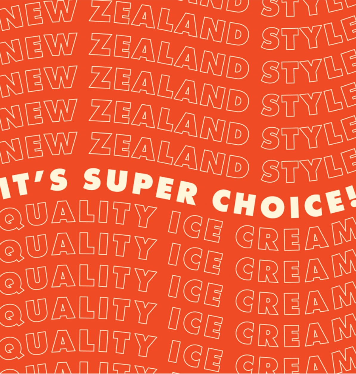
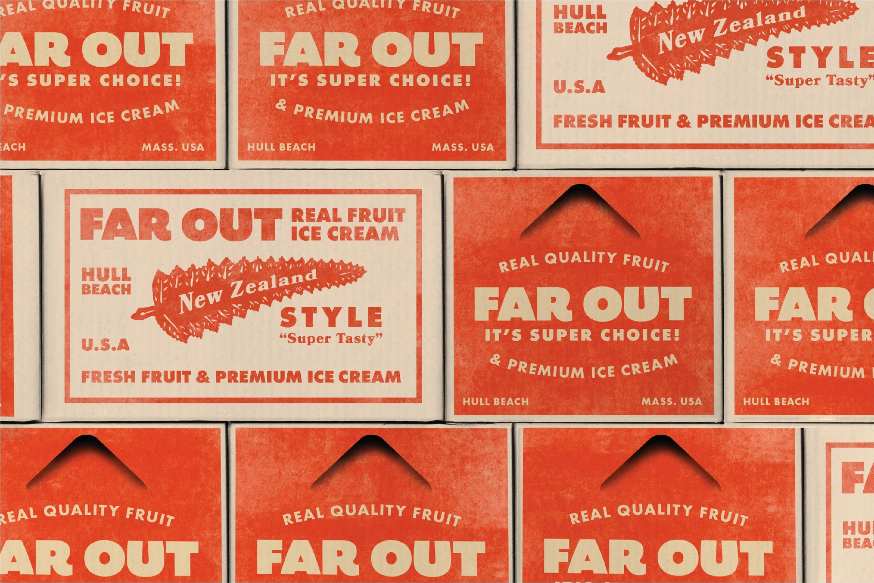
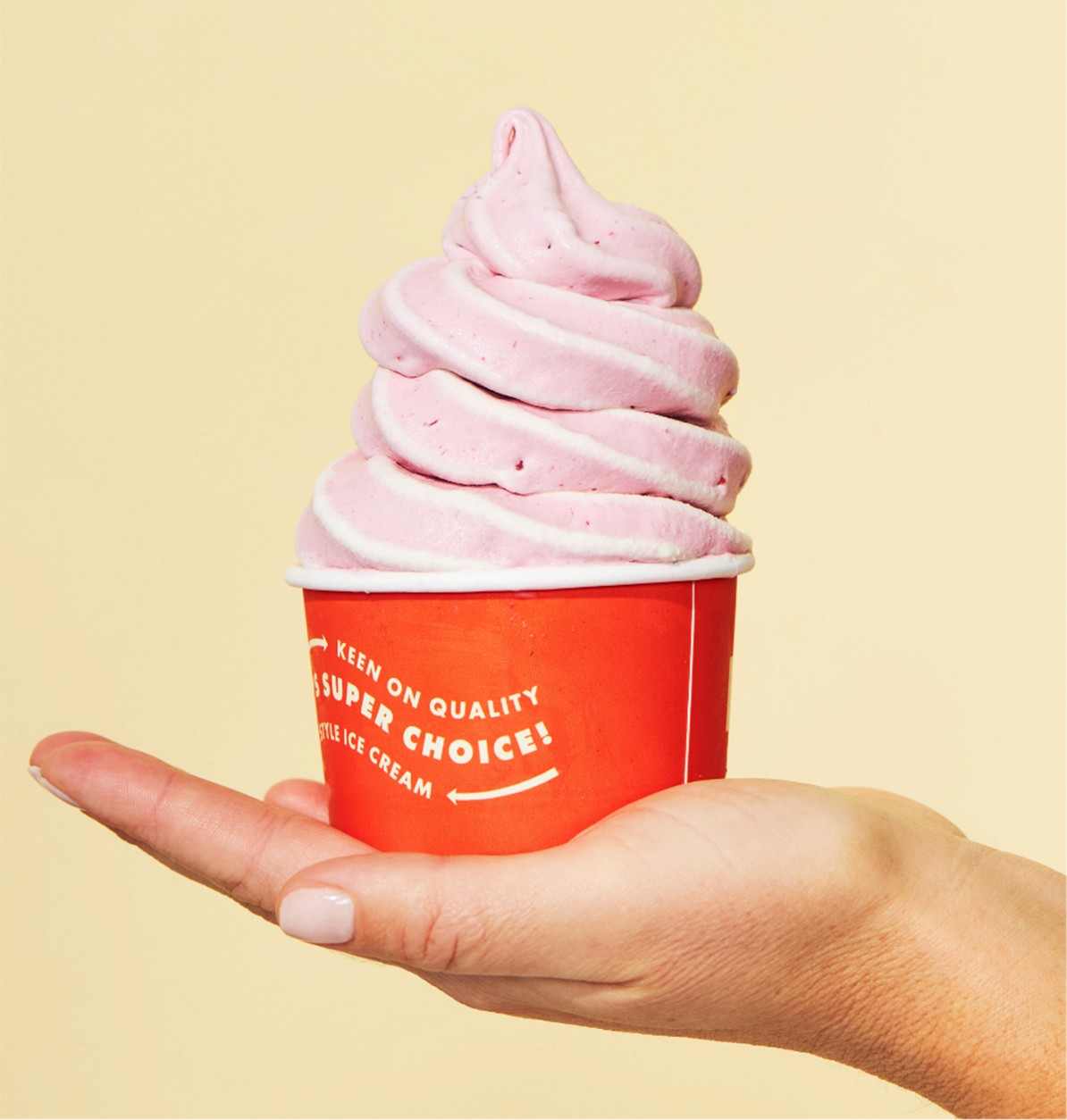
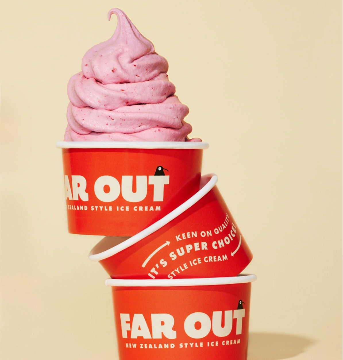
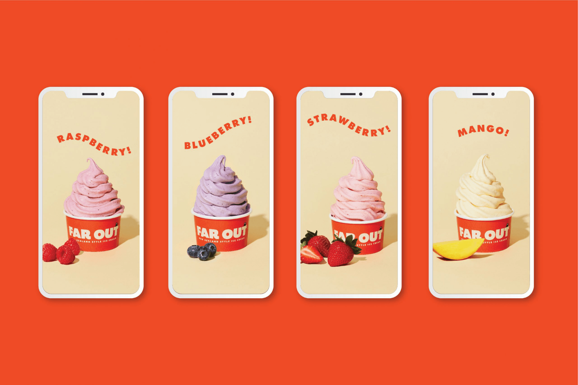
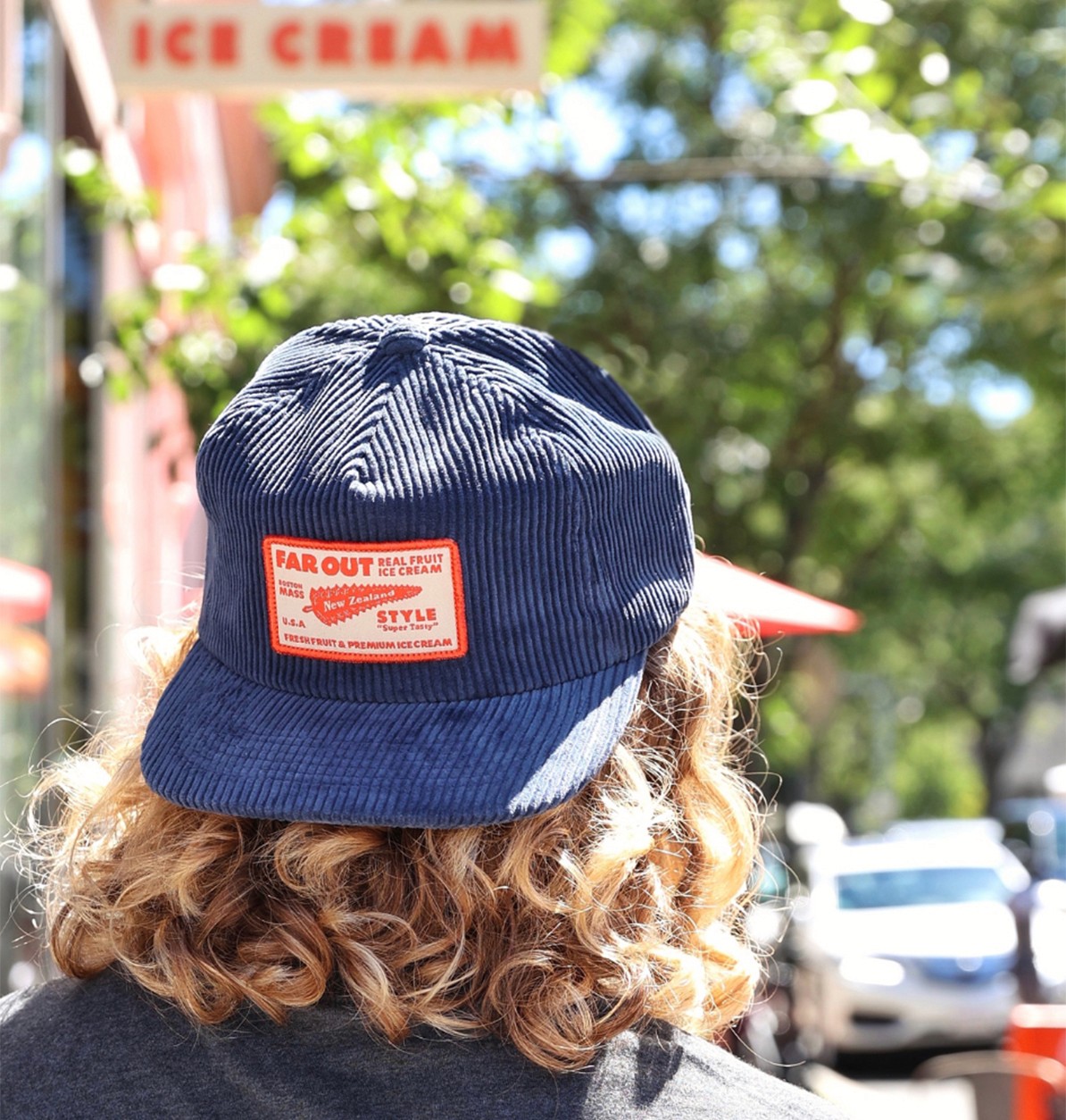
The name Far Out captures both distance and attitude. It references the product’s origin while feeling expressive and immediate, something that works as both a statement and a reaction. To support that tone, we developed Enzy, a kiwi bird character used across packaging, signage, and merchandise. The character anchors the brand while allowing flexibility in how it appears. The identity stays loose in composition and character, but holds through consistent color, typography, and the repeated use of Enzy across applications.
Retail and Environmental Design
Far Out launched during COVID through a series of pop-ups across Boston. These early environments were designed to test the concept in real time and build recognition quickly. As demand grew, the brand expanded into its first permanent location in Brookline. The system translated directly into interiors, signage, and merchandise without rework.

Growth Across Locations
What began as a pop-up concept now operates across three Boston-area locations: Brookline, Fenway, and Cambridge. The brand system supports expansion without redesign, allowing each space to adapt to its surroundings while maintaining a consistent identity.

Closing
A brand built to carry a specific experience from temporary pop-ups into permanent space, without losing what made it work.


Food & Beverage
Next Project:
Miller's Famous Sandwiches ›

" height="282.00000427246096px" id="auQ3nDAie" width="1120.0000146484376px"/><path d="M 19.8 0 C 8.88 0 0 8.864 0 19.752 C 0 30.639 8.89 39.504 19.8 39.504 C 30.72 39.504 39.6 30.639 39.6 19.752 C 39.6 8.864 30.72 0 19.8 0 Z M 19.8 36.787 C 10.39 36.787 2.72 29.142 2.72 19.752 C 2.72 10.362 10.39 2.717 19.8 2.717 C 29.21 2.717 36.88 10.362 36.88 19.752 C 36.88 29.142 29.21 36.787 19.8 36.787 Z" fill="rgb(244, 63, 28)" height="39.50400000000002px" id="ELbb_RJ7c" transform="translate(1060.02 184.054)" width="39.59999999999991px"/><path d="M 0 0 L 0 16.341 L 3.04 16.341 L 3.04 10.124 L 11.71 10.124 L 15.24 16.341 L 18.69 16.341 L 15.16 10.124 L 18.2 10.124 L 20.97 7.367 L 20.97 2.766 L 18.2 0.01 L 0 0.01 Z M 17.92 3.034 L 17.92 7.08 L 3.04 7.08 L 3.04 3.034 Z" fill="rgb(244, 63, 28)" height="16.341000000000008px" id="B3WshVHjd" transform="translate(1069.67 195.635)" width="20.970000000000027px"/></g></svg>)