
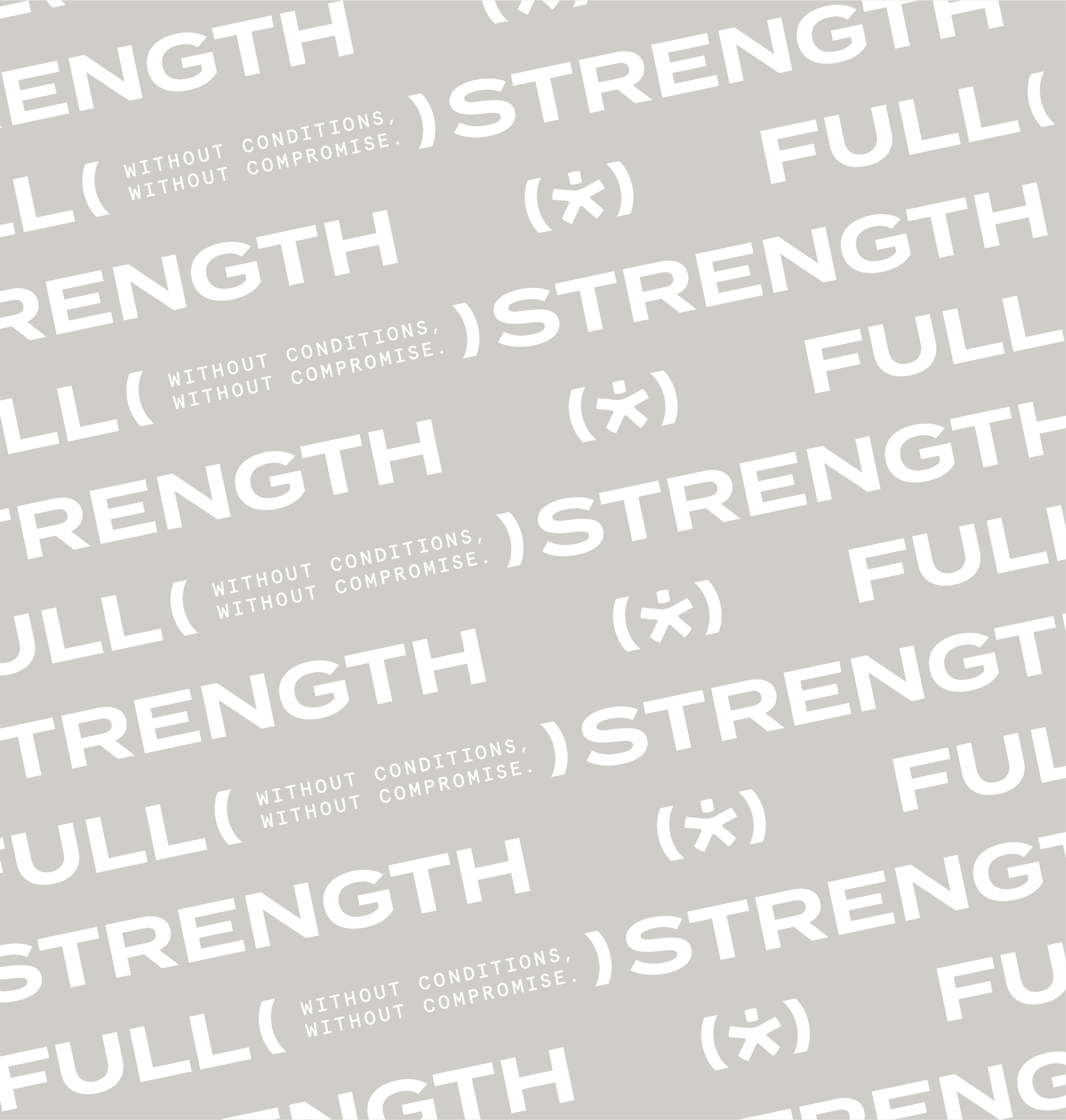

From Recovery to Strength
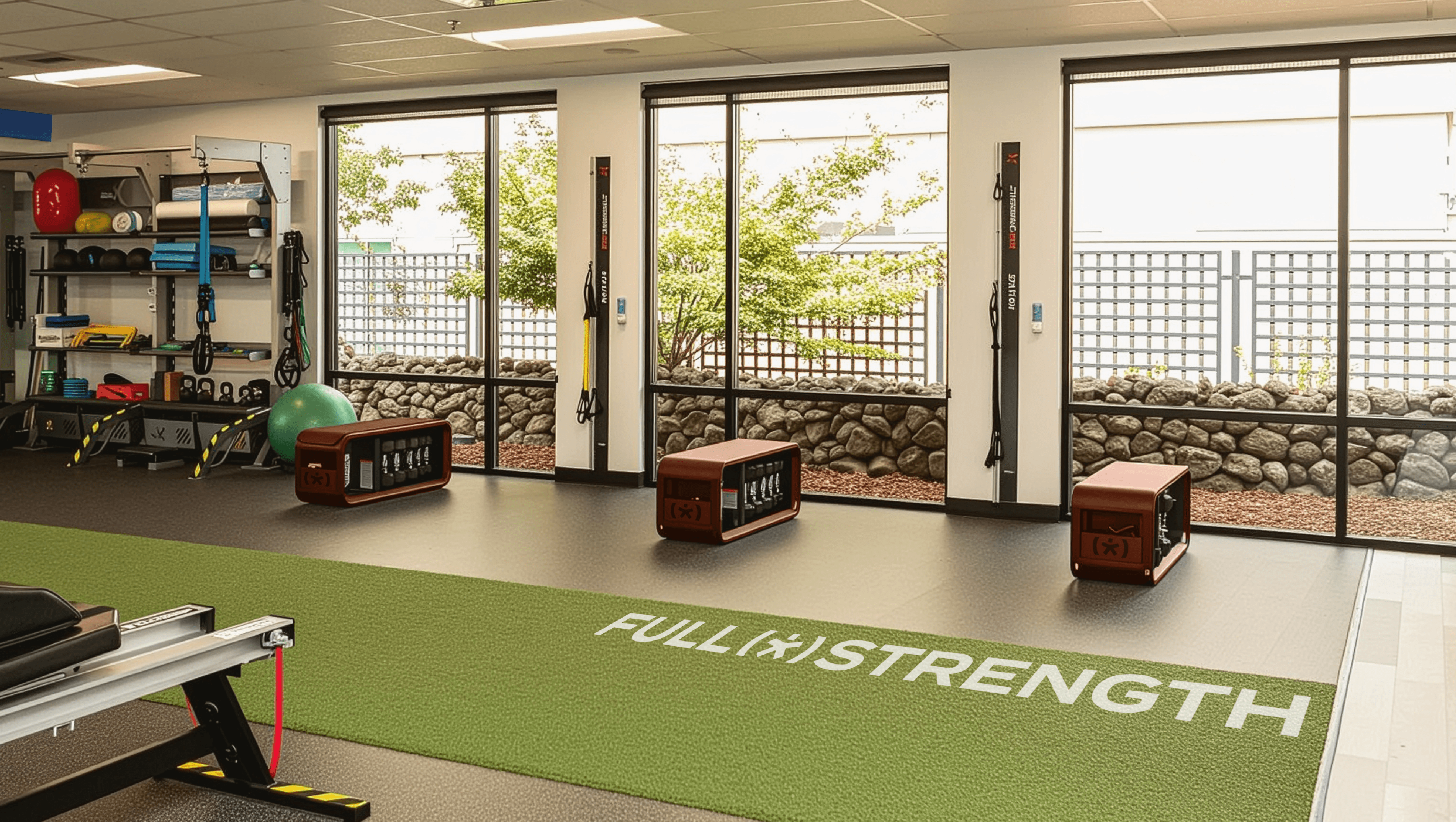
Traditional physical therapy is reactive. It treats injury, reduces pain, and stops there. Full Strength is proactive. Strength training is introduced from day one. Squat racks, progressive loading, and real-world movement are part of treatment—not something patients graduate into later. The goal is not just to return to baseline, but to leave more capable than before.
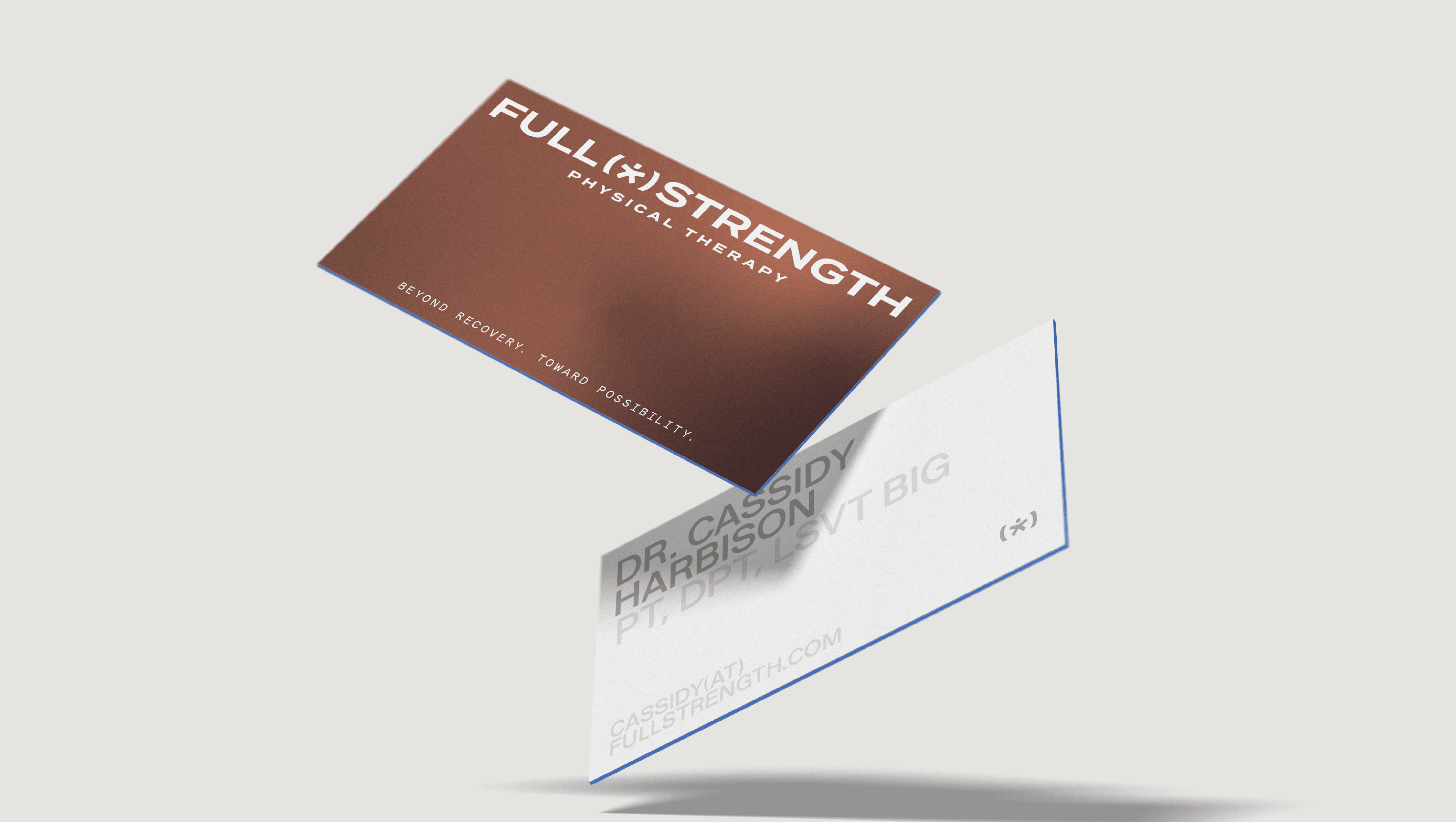
A Broader Definition of Athlete
This model requires a shift in who care is for. Full Strength isn’t built for elite athletes. It’s built for anyone whose life depends on their body. A mechanic on their feet all day. A parent carrying their kids. A runner trying to stay consistent. A grandparent staying mobile. If your life requires movement, you’re the audience.

Naming and Positioning
The name Full Strength captures both a moment and a mindset. It marks the point where someone returns to full capacity; but also the ongoing work required to stay there. The language is direct and familiar, intentionally avoiding clinical terminology. This positions the practice closer to performance than traditional healthcare, without losing credibility.
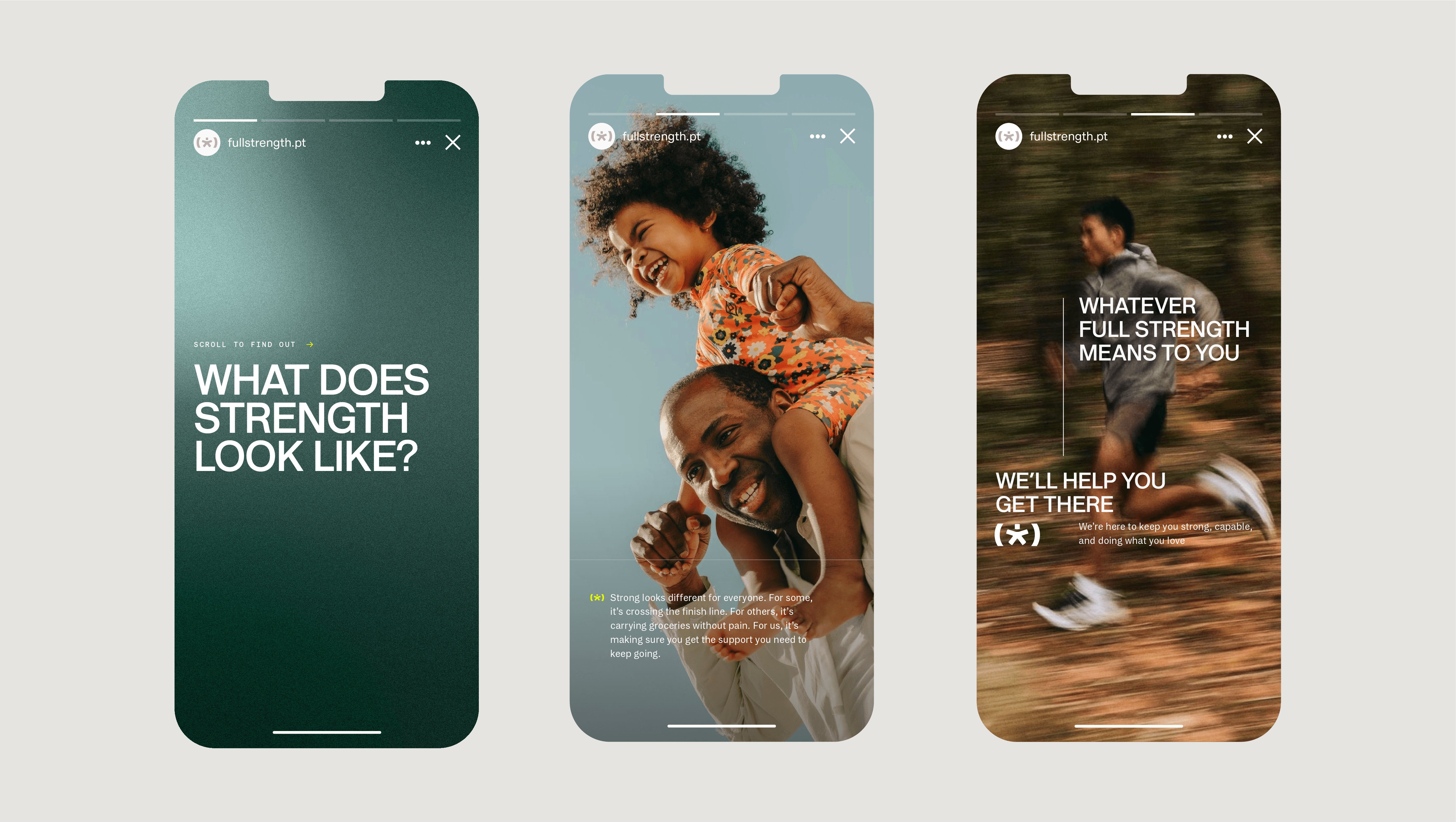
Identity System
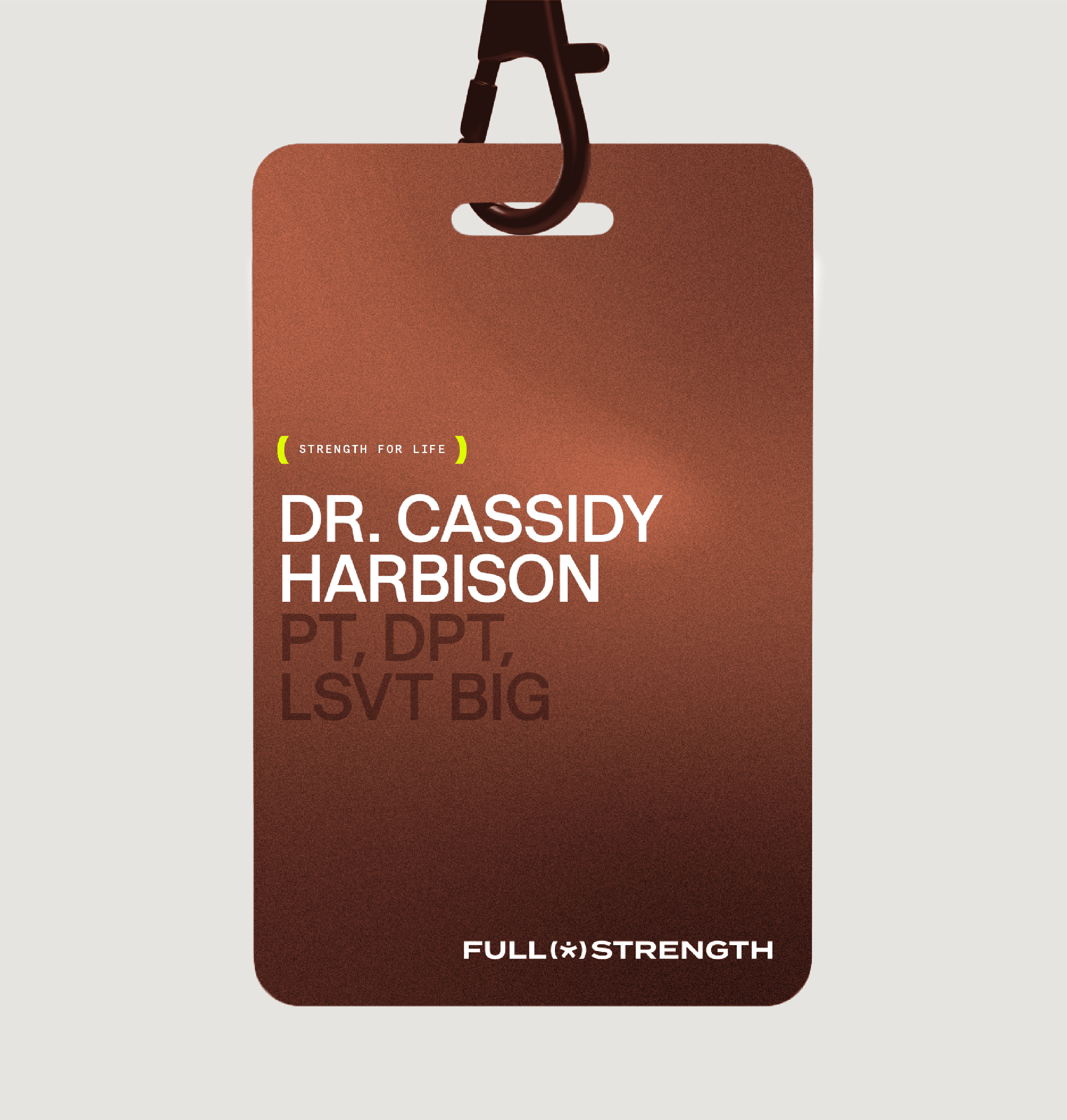
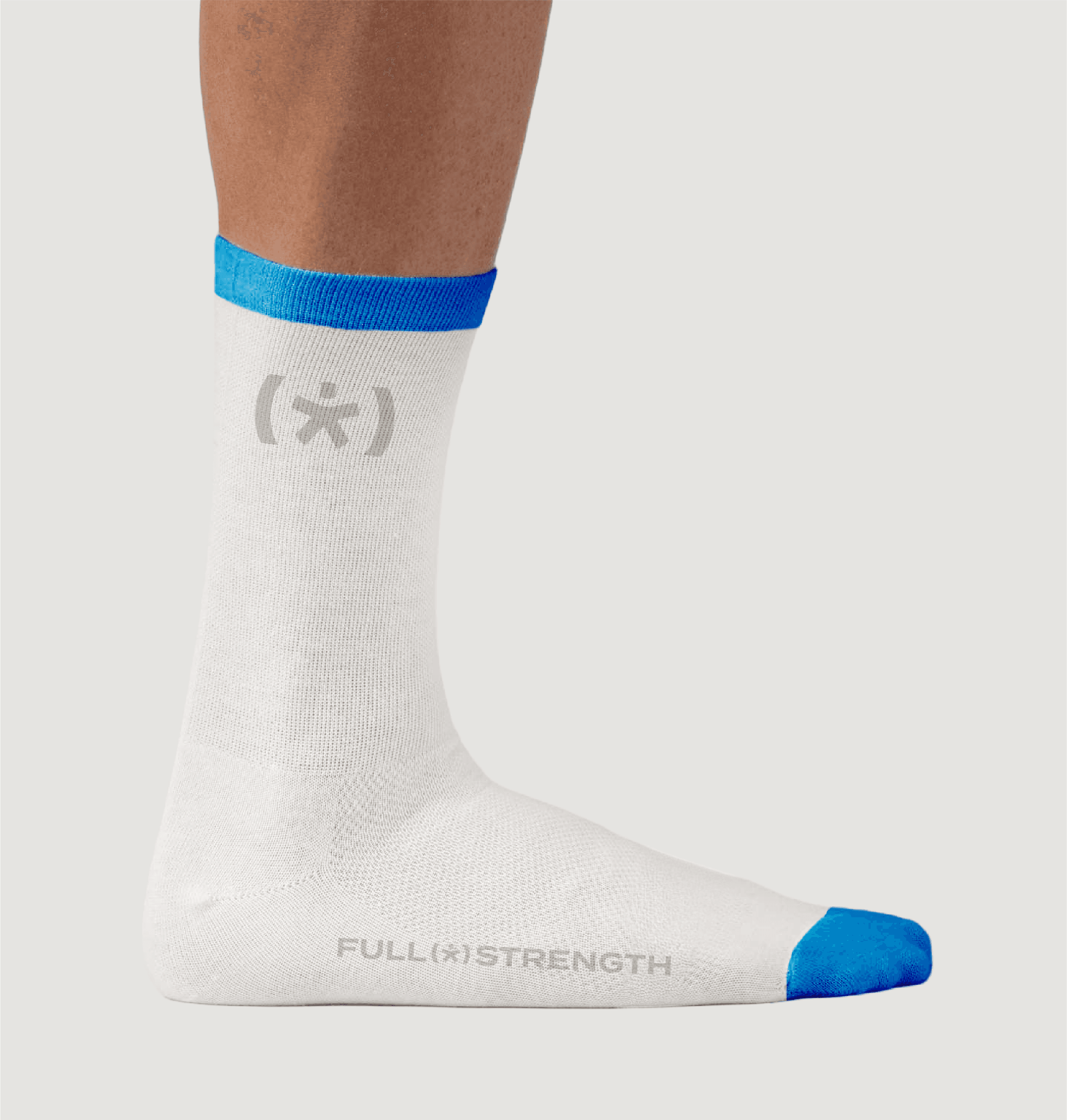
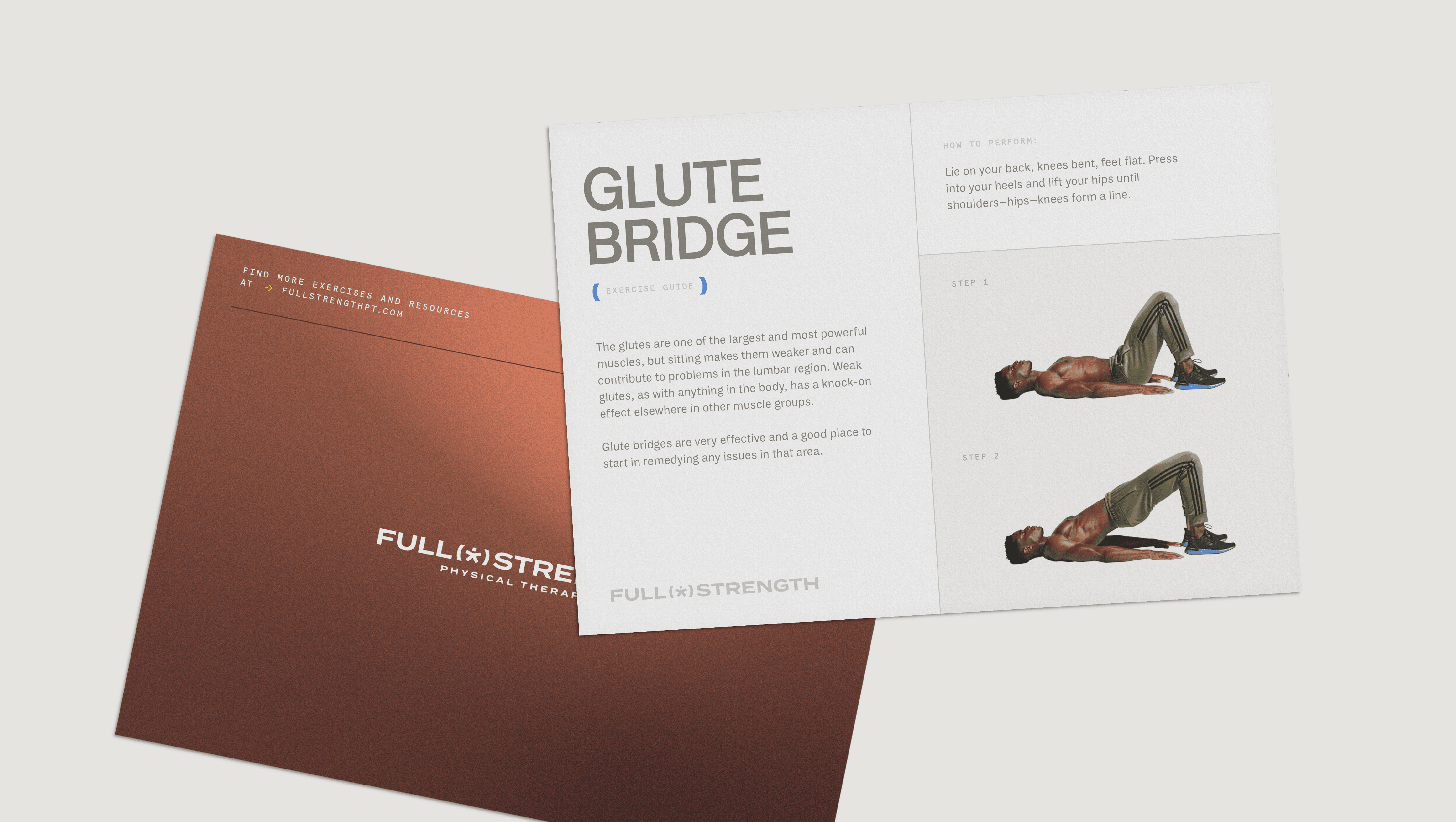
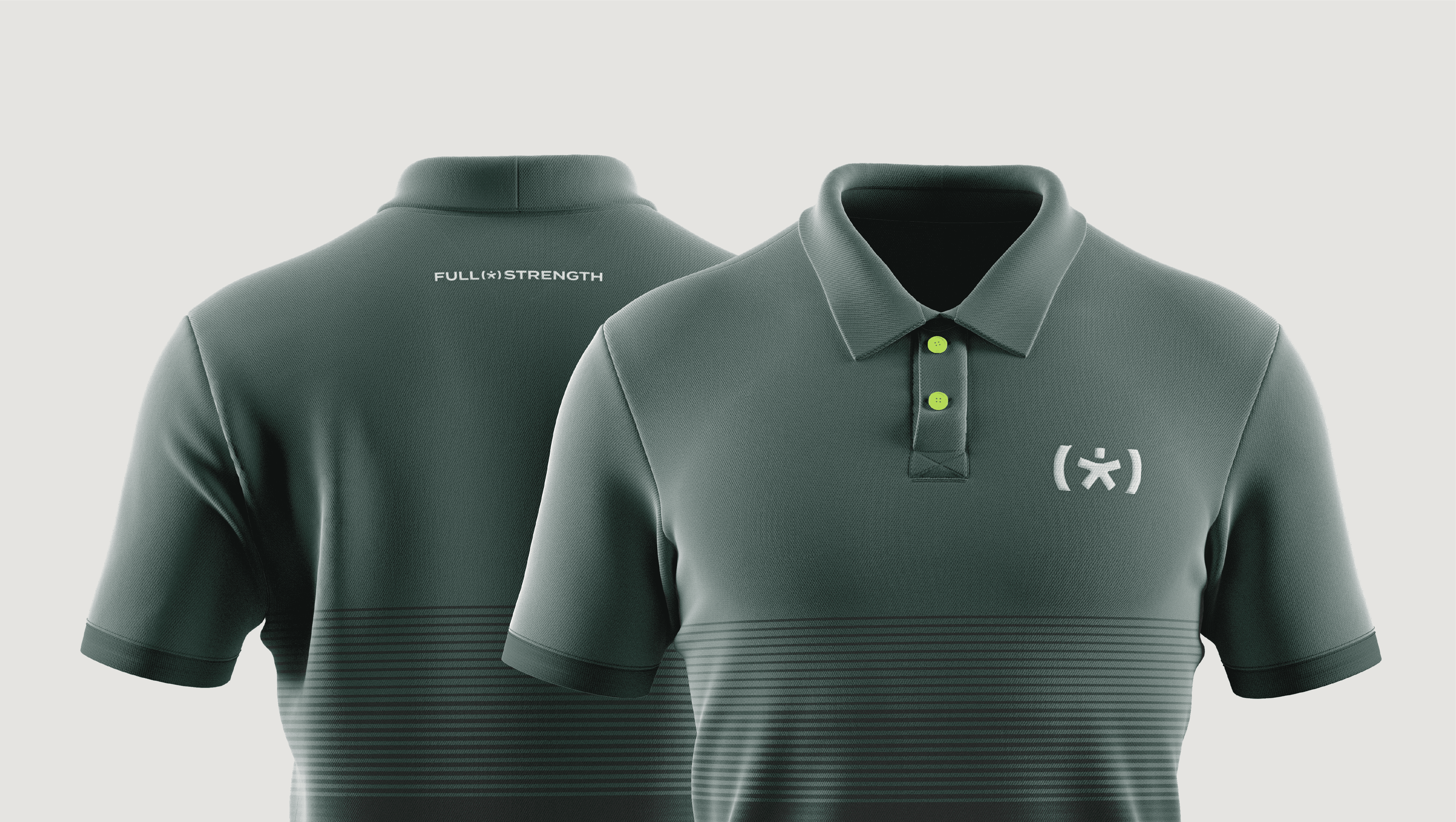
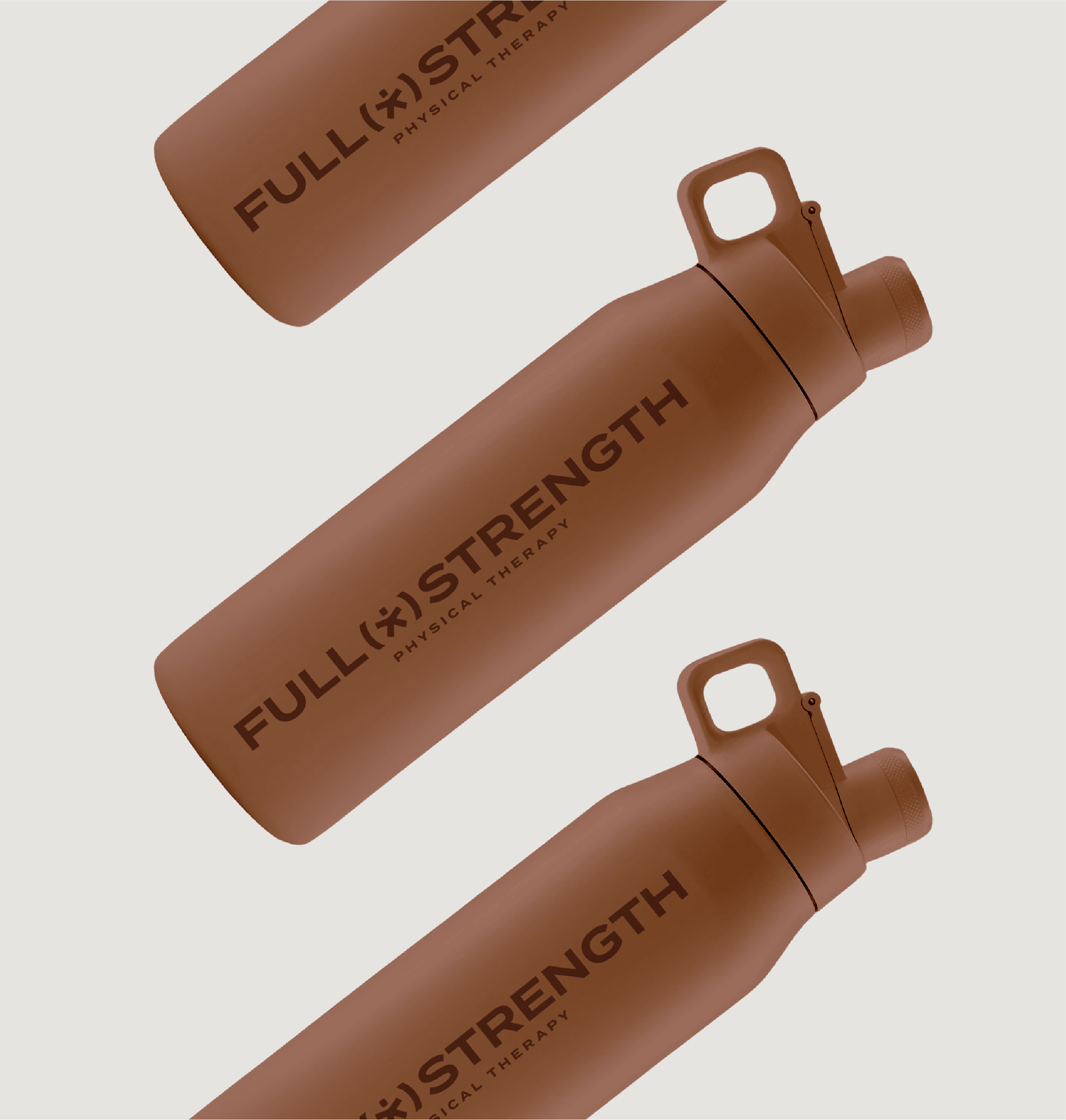
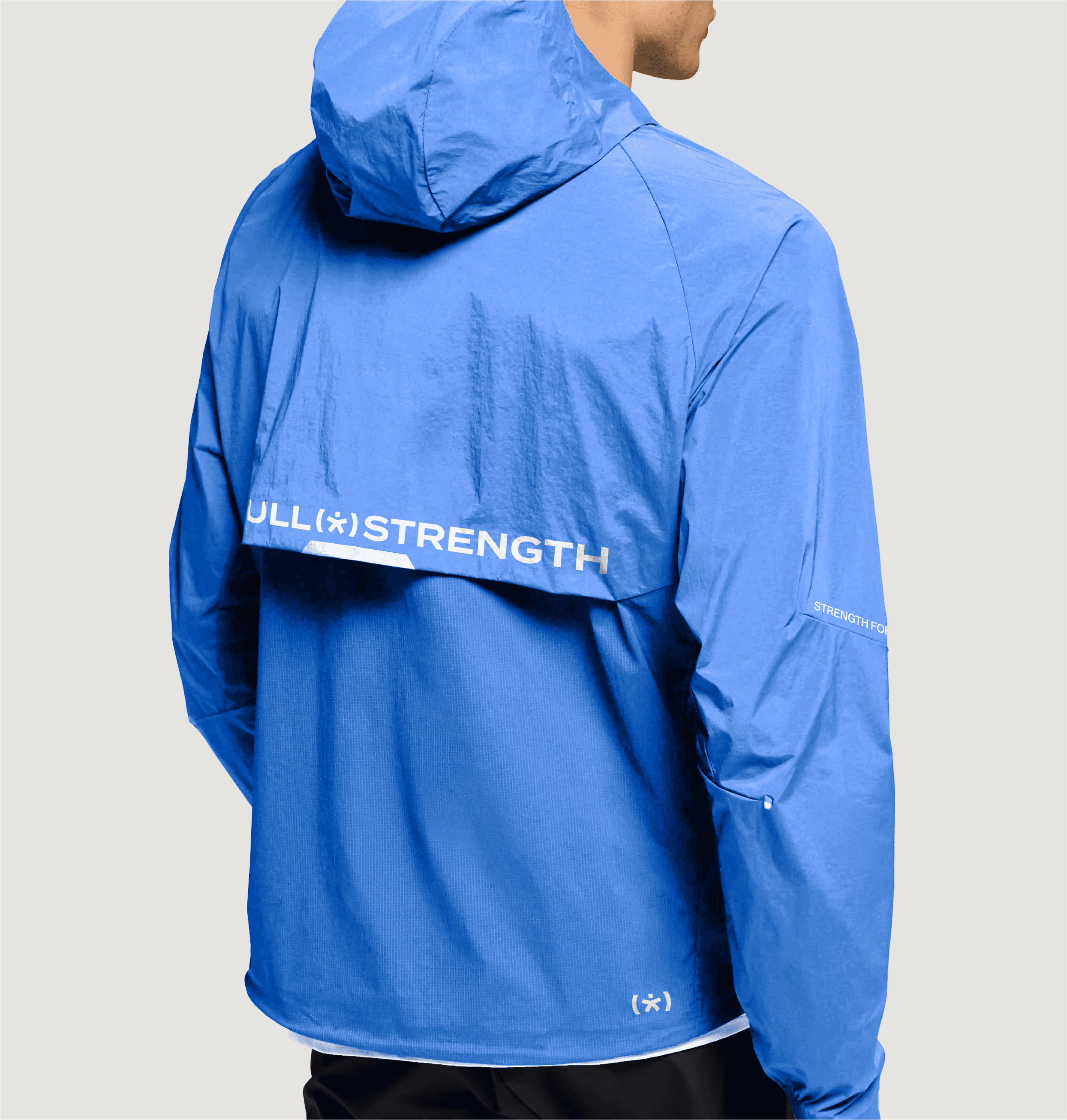
The identity is built around expansion, load, and range. At its center is a custom mark derived from an asterisk, reworked into a form that suggests the body under movement and tension. The mark expands and contracts across applications, reflecting progressive loading and how strength develops over time. It also functions structurally—anchoring layouts, organizing information, and creating a consistent rhythm across touchpoints. Rather than referencing clinical systems, the identity draws from training environments: clear, direct, and built for repeated use.

Positioned Between Physical Therapy and Performance Training
Full Strength sits between two categories. More active than a clinic. More focused than a gym. We removed passive, clinical language entirely, replacing it with messaging built around action, progression, and capability; while maintaining trust and clarity.

Launch and Foundation for Growth
Full Strength launched with a clear position in the market: a practice that treats injury and builds strength at the same time. The brand provides a foundation for growth across locations, services, and patient experience; supporting both immediate care and long-term progression.
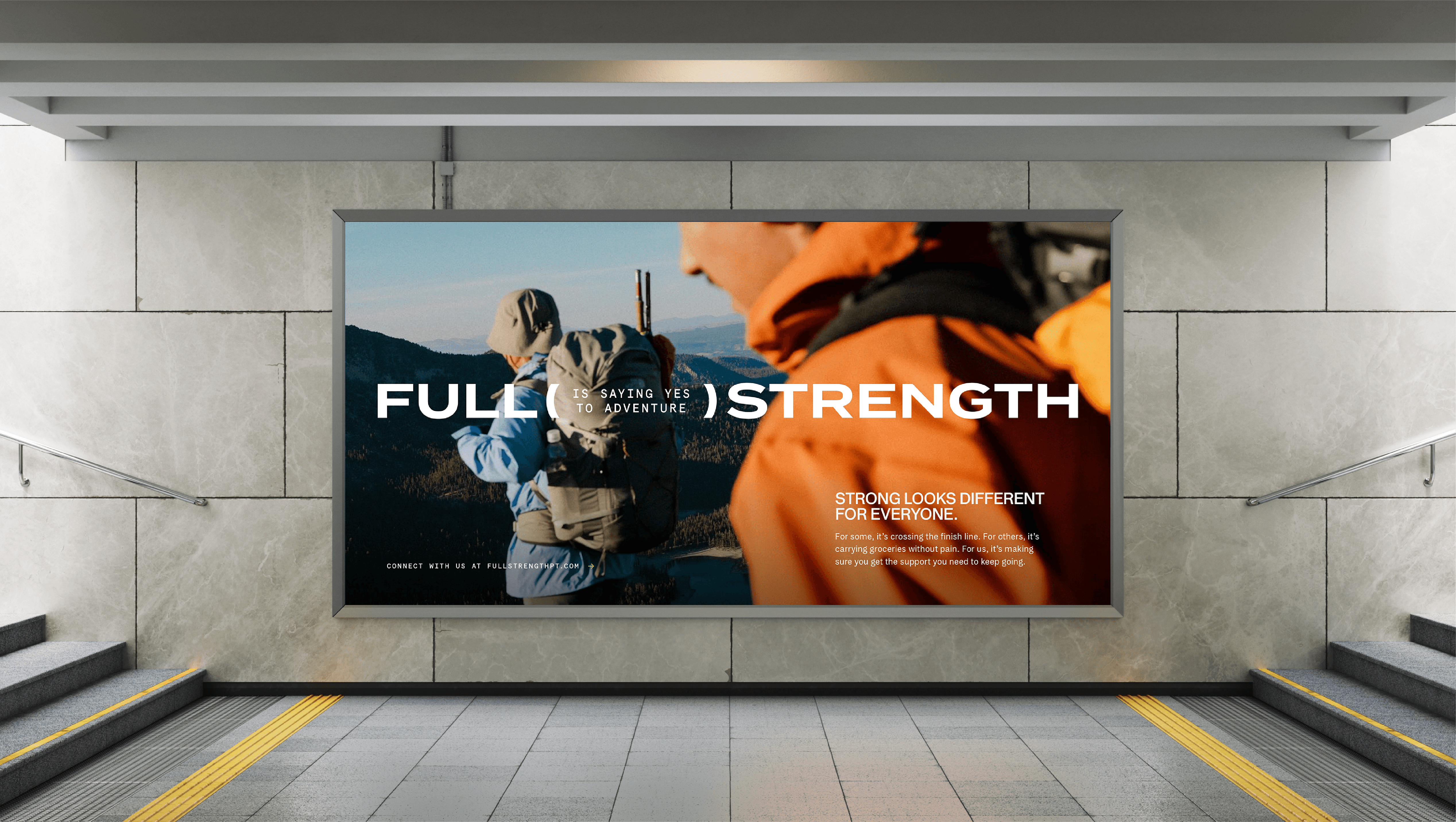
Closing
Recovery gets you back. Strength keeps you there.




Health & Wellness
Next Project:
Highbar ›

" height="282.00000427246096px" id="auQ3nDAie" width="1120.0000146484376px"/><path d="M 19.8 0 C 8.88 0 0 8.864 0 19.752 C 0 30.639 8.89 39.504 19.8 39.504 C 30.72 39.504 39.6 30.639 39.6 19.752 C 39.6 8.864 30.72 0 19.8 0 Z M 19.8 36.787 C 10.39 36.787 2.72 29.142 2.72 19.752 C 2.72 10.362 10.39 2.717 19.8 2.717 C 29.21 2.717 36.88 10.362 36.88 19.752 C 36.88 29.142 29.21 36.787 19.8 36.787 Z" fill="rgb(244, 63, 28)" height="39.50400000000002px" id="ELbb_RJ7c" transform="translate(1060.02 184.054)" width="39.59999999999991px"/><path d="M 0 0 L 0 16.341 L 3.04 16.341 L 3.04 10.124 L 11.71 10.124 L 15.24 16.341 L 18.69 16.341 L 15.16 10.124 L 18.2 10.124 L 20.97 7.367 L 20.97 2.766 L 18.2 0.01 L 0 0.01 Z M 17.92 3.034 L 17.92 7.08 L 3.04 7.08 L 3.04 3.034 Z" fill="rgb(244, 63, 28)" height="16.341000000000008px" id="B3WshVHjd" transform="translate(1069.67 195.635)" width="20.970000000000027px"/></g></svg>)