
The Challenge
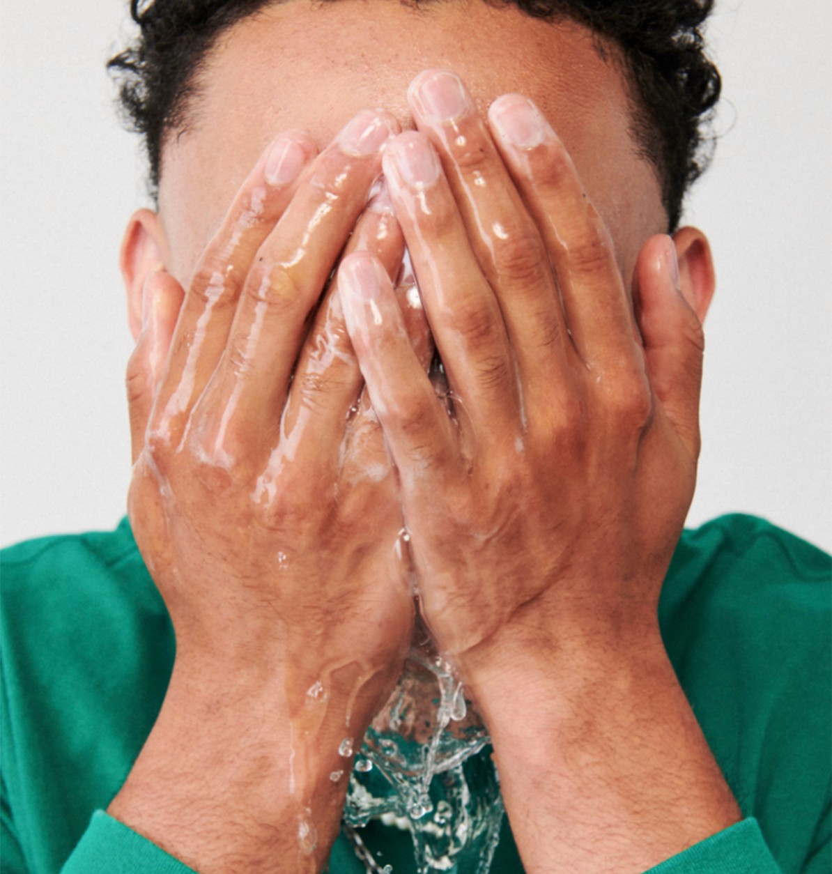
Even though Flōōk is a brand meant specifically for young men, the identity had to speak to a generation that doesn’t fit neatly into stereotypical gendered roles. The branding needed to speak to an increasingly environmentally-savvy generation, and simultaneously say, “It’s ok to have a gym routine” and “It’s ok to have a daily skincare routine” without beating anyone over the head with it. That’s a lot of boxes to check!


Our Approach
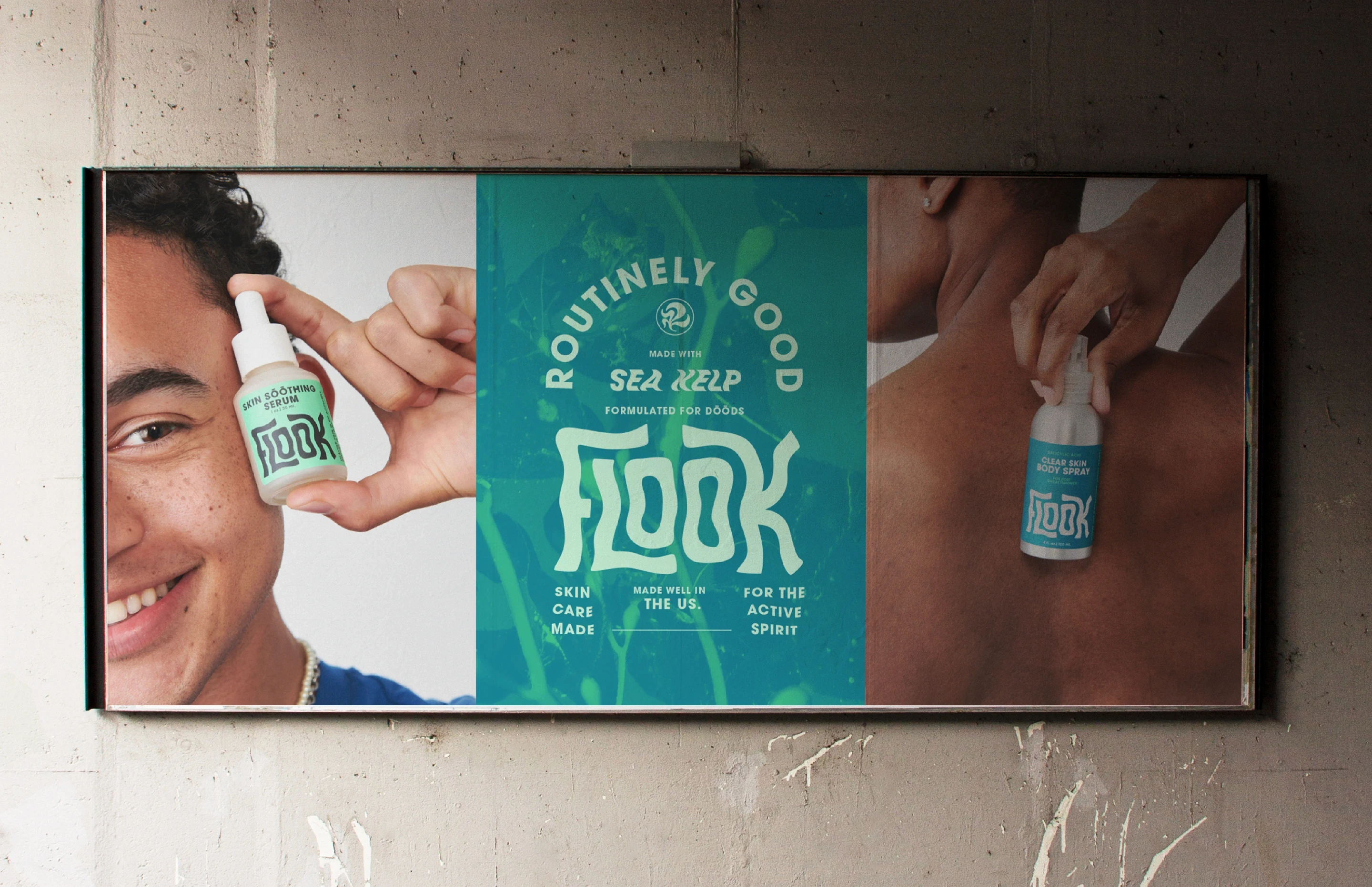
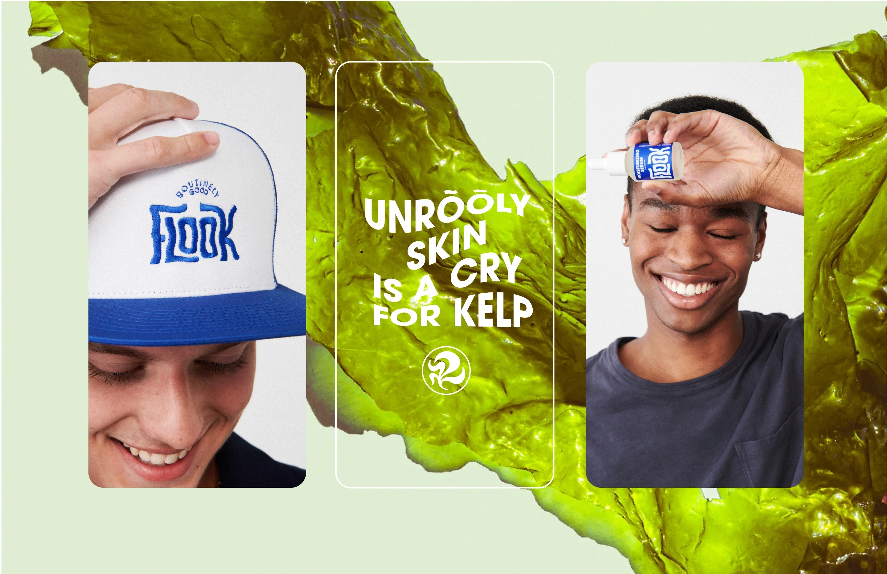
Flook harnesses the power of sea kelp to nourish skin. We knew that this was where to lean in to emphasize Flook’s natural ingredients and maintain a young aesthetic that avoids the dark, masculine branding typically pushed on young men. With the sea as our guide, we set forth to bring together a cohesive visual identity across all aspects of the Flōōk brand.

Logomark
Their wordmark draws parallels with the unbroken movement inherent in the kelp forests of coastal habitats and this movement is further emphasized in the kelp-inspired logo itself. These elements along with a color palette of greens and blues are playful, appealing, and evocative of Flōōk’s natural ingredients.

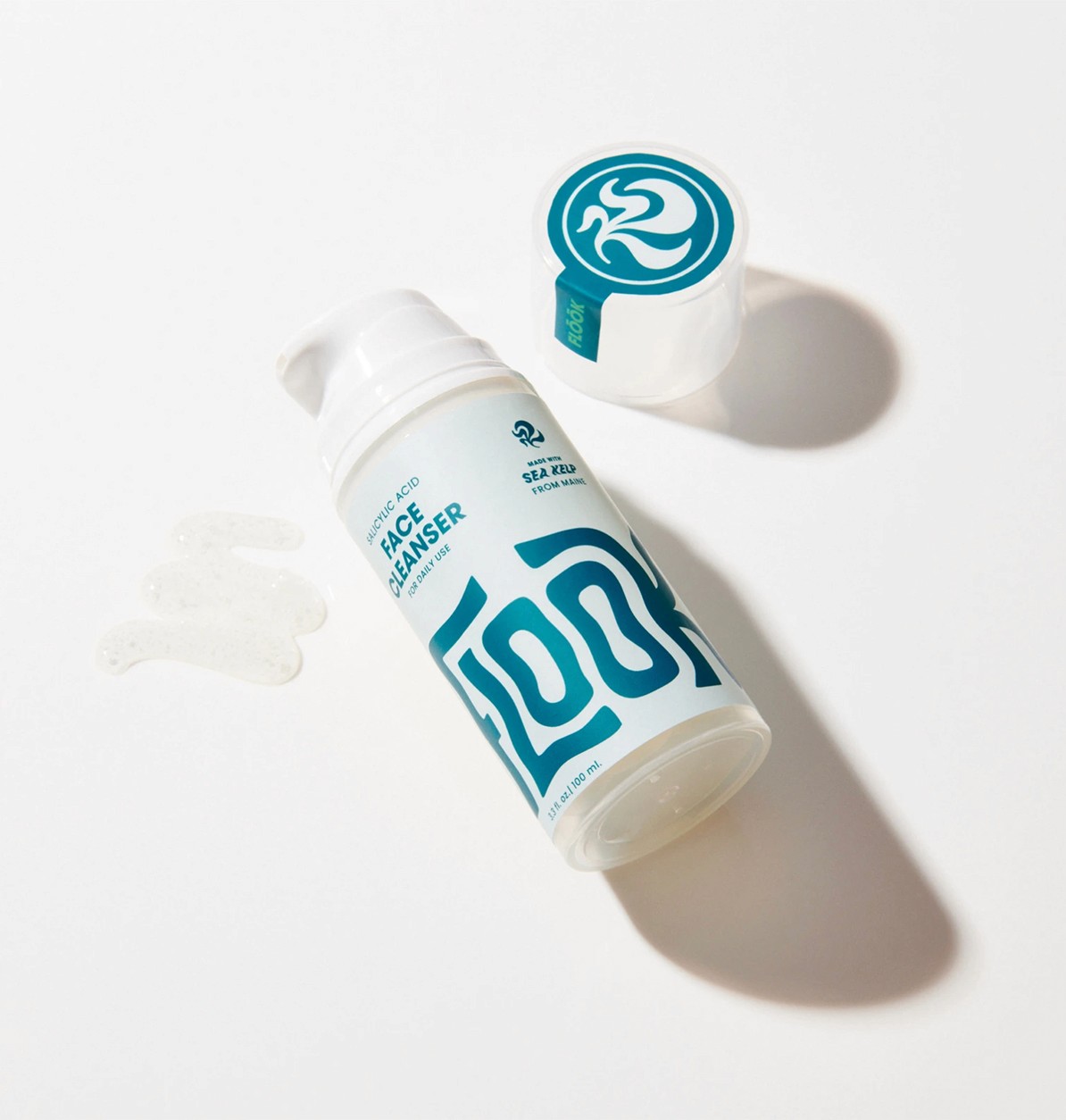
Packaging
Gen-Z is used to being marketed too and can see insincerity from a mile away. The packaging had to be as honest and as uncomplicated as their product. Transparency about the ingredients they use and what makes them safe and effective with a clean and simple aesthetic was the key.
Consumer Goods
Next Project:
Foraged Market Brand Campaign ›

" height="282.00000427246096px" id="auQ3nDAie" width="1120.0000146484376px"/><path d="M 19.8 0 C 8.88 0 0 8.864 0 19.752 C 0 30.639 8.89 39.504 19.8 39.504 C 30.72 39.504 39.6 30.639 39.6 19.752 C 39.6 8.864 30.72 0 19.8 0 Z M 19.8 36.787 C 10.39 36.787 2.72 29.142 2.72 19.752 C 2.72 10.362 10.39 2.717 19.8 2.717 C 29.21 2.717 36.88 10.362 36.88 19.752 C 36.88 29.142 29.21 36.787 19.8 36.787 Z" fill="rgb(244, 63, 28)" height="39.50400000000002px" id="ELbb_RJ7c" transform="translate(1060.02 184.054)" width="39.59999999999991px"/><path d="M 0 0 L 0 16.341 L 3.04 16.341 L 3.04 10.124 L 11.71 10.124 L 15.24 16.341 L 18.69 16.341 L 15.16 10.124 L 18.2 10.124 L 20.97 7.367 L 20.97 2.766 L 18.2 0.01 L 0 0.01 Z M 17.92 3.034 L 17.92 7.08 L 3.04 7.08 L 3.04 3.034 Z" fill="rgb(244, 63, 28)" height="16.341000000000008px" id="B3WshVHjd" transform="translate(1069.67 195.635)" width="20.970000000000027px"/></g></svg>)